Renew Toronto
Brand Identity x Marketing x Event Installation
In 2019, OCY Toronto commissioned 99Designs to create the first version of the Renew Toronto logo for the launch of the Renew Toronto Young Adult Conference. The brief included the conference’s primary purpose and target audience as religious or faith-oriented (specifically, Catholic and/or Christian). The winning design created a version of the Sacred Heart of Jesus as the logomark to symbolize the Catholic faith, God’s love and Jesus’ invitation for all people to enter into a personal relationship with Him.
The conference was cancelled for 2 years due to the pandemic and was relaunched in November 2022. At this time, communities were disconnected and people were aching for reconnection and renewal. This led to the inspiration of “reunion” — inviting all people to gather as members of the same family to be renewed together.
To celebrate its relaunching, the logo and brand underwent its own renewal and revival process. Our approach to the refreshed logo was a natural evolution rather than a complete overhaul. The brand’s core elements and values are still preserved, but with a more contemporary and refined approach. The refreshed logo aims to improve brand recognition and keep it visually relevant for the conference’s target audience of young adults (19-39). Simplifying complex shapes, adding key visual elements, refining the colour scheme, and choosing a more striking font brought this logo from “concept” to “completion.”

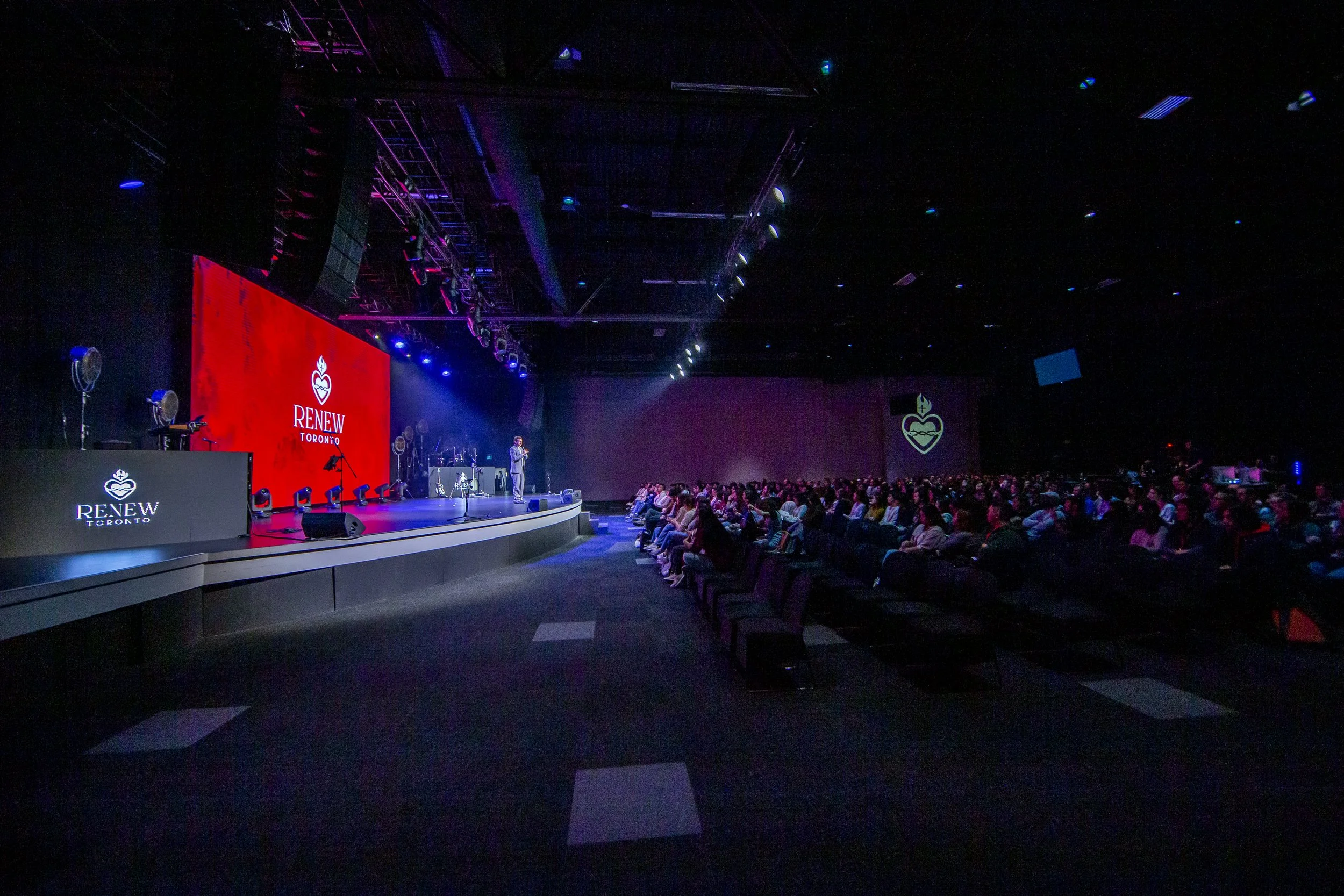
The refreshed brand identity was used across all platforms from promotion to event production — banners, screens, I.D. badges, decorations, and merchandise.
Similar events such as SEEK ‘22 and CCO’s Rise Up Conference competed for the same audience as Renew Toronto. By leveraging OCY Toronto’s existing social media following, its ministry collaborators and sponsorship network, we were able to launch successful print and digital marketing campaigns that kept costs low and went above projections and goals for ticket sales.


